
Blog Post 0
In this post, I’ll teach you how to create a simple, yet interesting data visualization using the pandas and seaborn libraries in Python.
Background
The data set we’ll be using, the Palmer Penguins data set, is comprised of statistics recorded of penguins near the Palmer Station in Antarctica, made available by Dr. Kirsten Gorman.
Data Set
Let’s import and take a look at the columns in the data set:
import pandas as pd

url = "https://raw.githubusercontent.com/PhilChodrow/PIC16B/master/datasets/palmer_penguins.csv"
penguins = pd.read_csv(url)
penguins.head()
| studyName | Sample Number | Species | Region | Island | Stage | Individual ID | Clutch Completion | Date Egg | Culmen Length (mm) | Culmen Depth (mm) | Flipper Length (mm) | Body Mass (g) | Sex | Delta 15 N (o/oo) | Delta 13 C (o/oo) | Comments | |
|---|---|---|---|---|---|---|---|---|---|---|---|---|---|---|---|---|---|
| 0 | PAL0708 | 1 | Adelie Penguin (Pygoscelis adeliae) | Anvers | Torgersen | Adult, 1 Egg Stage | N1A1 | Yes | 11/11/07 | 39.1 | 18.7 | 181.0 | 3750.0 | MALE | NaN | NaN | Not enough blood for isotopes. |
| 1 | PAL0708 | 2 | Adelie Penguin (Pygoscelis adeliae) | Anvers | Torgersen | Adult, 1 Egg Stage | N1A2 | Yes | 11/11/07 | 39.5 | 17.4 | 186.0 | 3800.0 | FEMALE | 8.94956 | -24.69454 | NaN |
| 2 | PAL0708 | 3 | Adelie Penguin (Pygoscelis adeliae) | Anvers | Torgersen | Adult, 1 Egg Stage | N2A1 | Yes | 11/16/07 | 40.3 | 18.0 | 195.0 | 3250.0 | FEMALE | 8.36821 | -25.33302 | NaN |
| 3 | PAL0708 | 4 | Adelie Penguin (Pygoscelis adeliae) | Anvers | Torgersen | Adult, 1 Egg Stage | N2A2 | Yes | 11/16/07 | NaN | NaN | NaN | NaN | NaN | NaN | NaN | Adult not sampled. |
| 4 | PAL0708 | 5 | Adelie Penguin (Pygoscelis adeliae) | Anvers | Torgersen | Adult, 1 Egg Stage | N3A1 | Yes | 11/16/07 | 36.7 | 19.3 | 193.0 | 3450.0 | FEMALE | 8.76651 | -25.32426 | NaN |
As we can see, each row in the data set is a penguin, and the date when the egg was observed, the penguin’s body mass, and the penguin’s sex are observed in the columns Date Egg, Body Mass (g), Sex, respectively.
Something we would be interested in is the difference in body mass between male and female penguins over time. Are male penguins generally heavier than female penguins, or is the opposite true? Has the average mass of a penguin changed over time? Let’s answer these questions with a data visualization.
Data Cleaning
To start, let’s clean the Date Egg column. The dates are too granular in their current state—they contain the date of the egg’ observation, which is too detailed and will lead to a cluttered visualization. Let’s remove the date from the observations and make the column a datetime column.
# dropping NaN values and keeping only male and female penguins
penguins.dropna()
penguins = penguins[penguins["Sex"] != "."]

# splitting Date Egg column, into month, day, and year
penguins[["Month Egg", "Day Egg", "Year Egg"]] = penguins["Date Egg"].str.split("/", expand = True)

# noting that all years begin with "20"
penguins["Year Egg"] = "20" + penguins["Year Egg"]

# converting the month and year into a datetime object
penguins["Year-Month Egg"] = pd.to_datetime(penguins["Year Egg"] + "-" + penguins["Month Egg"])

penguins["Year-Month Egg"].head()
0   2007-11-01
1   2007-11-01
2   2007-11-01
3   2007-11-01
4   2007-11-01
Name: Year-Month Egg, dtype: datetime64[ns]
Data Manipulation
Now that we can use the Year-Month Egg column, the next step is to find the averages of the penguins’ body mass by sex and month. To do that, we use the groupby() and reset_index() functions.
# finding the mean body mass per month by sex
averages = penguins.groupby(["Sex", "Year-Month Egg"])[["Body Mass (g)"]].mean()

# resetting dataframe
averages = averages.reset_index()

averages.head()
| Sex | Year-Month Egg | Body Mass (g) | |
|---|---|---|---|
| 0 | FEMALE | 2007-11-01 | 3792.187500 |
| 1 | FEMALE | 2007-12-01 | 4283.333333 |
| 2 | FEMALE | 2008-11-01 | 3887.500000 |
| 3 | FEMALE | 2009-11-01 | 3839.732143 |
| 4 | FEMALE | 2009-12-01 | 4837.500000 |
Data Visualization
The dataframe is ready for visualization. We use the seaborn library to create a lineplot of the penguin’s body mass over time, by the penguins’ sex.
import seaborn as sns

# making axis fonts smaller
sns.set(font_scale = 0.75)

sns.lineplot(data = averages,
             x = "Year-Month Egg",
             y = "Body Mass (g)",
             hue = "Sex").set(title = "Body Mass of Female and Male Penguins Over Time")
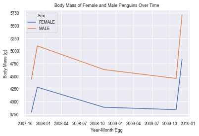
As we can see, the average body mass of male penguins is higher than female penguins across all months. Average body masses across both sexes increased from 2007 to 2008, declined until 2010, where they saw a sharp increase. Was there more food for the penguins in 2010? Were there less natural predators for the penguins? More research is necessary to find out.